Brand The WarPulse mark
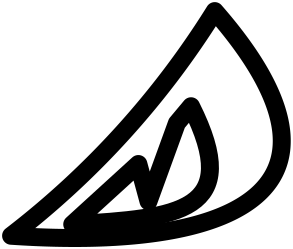
The WarPulse mark is a single eye taken from the company's first mascot. This page tells how it got here and how to use it.
01 / 04 2014
WarPulse started in 2014 with a face: two swept, blade-shaped eyes, each with a W cut into it, over a crescent grin of sharp teeth. It was drawn in blue with a glossy outline, the way logos were drawn then.
This is a minimal line drawing of it, so the shapes are easy to compare.
02 / 04 June 2026
In June 2026 the site swapped the mascot for a gold W. It was clean, but it could have belonged to anyone, and it dropped everything people knew us by.
03 / 04 October 2026
The redesign went back to the mascot and kept the most distinctive part of it. The grin went, then the left eye. The right eye stayed, as an outline, flat, with no gloss.
The 2014 face
04 / 04 October 2026
The eye was measured from the centre of the 2014 outline, then rebuilt from seven clean pieces: one circular arc for the top edge, one curve for the outer sweep, one for the inner bowl, and four straight cuts for the notch. Every tip ends where the original's does.
Drawn this way it stays crisp from a billboard down to a 16 pixel favicon.
Usage The lockup and colours
The eye leads the name, about twice its cap height, set in Nunito ExtraBold. Below 32 pixels the line gets heavier so the notch stays open.
Indigo#4F46E5
Ink#14142A
Ground#F7F7FB
Night#0B0B1A
Indigo on night#818CF8
Live#0E7490